Histograms are a powerful visual tool for analyzing and presenting data. Whether you’re a student working on a project or a professional creating reports, knowing how to make a histogram can be a valuable skill. Microsoft Word, one of the most widely used word processing software, offers a simple and convenient way to create histograms to represent data. In this blog post, we’ll walk you through the step-by-step process of making a histogram on Microsoft Word in 2023.
But before we dive into the nitty-gritty of creating a histogram, let’s quickly define the frequency. In statistical terms, frequency refers to the number of times a particular value occurs in a given set of data. Understanding this concept is crucial as it forms the foundation of constructing a histogram. So, whether you’re a beginner or someone looking for a refresher, you’ve come to the right place! Let’s explore how you can effectively showcase your data using histograms in Microsoft Word.
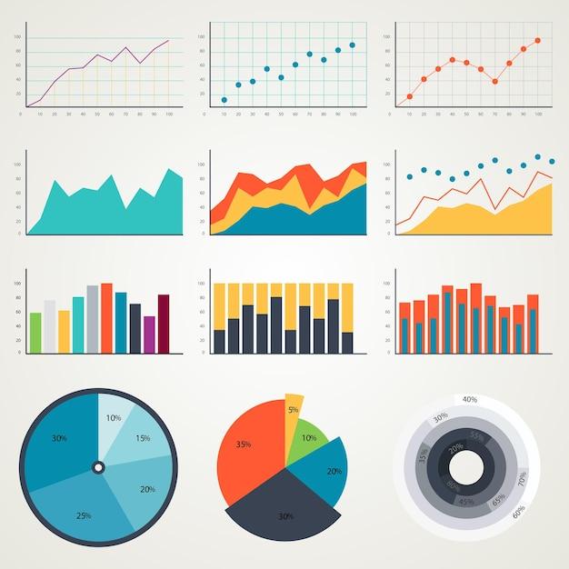
How to Create a Histogram on Microsoft Word?
So, you want to dive into the world of histograms, eh? Well, buckle up because I’m about to show you how to create one using the power of Microsoft Word! You might be thinking, “Word? Seriously?” Oh, my friend, never underestimate the hidden gems that can be found in the most unexpected places.
Getting Started: Inserting a Chart
Before we unleash the histogram-making magic, we need to lay the foundation. Fire up Microsoft Word and open a blank document. Now, go ahead and click on the Insert tab at the top of the window. You’ll see a bunch of options there, but we’re looking for something special – Charts.
Choosing the Right Chart: Bar Chart to the Rescue
Ah, the sweet sound of progress. Now that you’ve clicked on Charts, a world of possibilities awaits. But don’t worry, we won’t get lost in the maze. We’re here to conquer histograms, remember? So scroll down, my friend, and select the mighty Bar chart.
Preparing Your Data: The Joy of Numbers
Hold on tight, because we’re about to embark on a journey through the realm of data. Every histogram needs some numbers to party with, so make sure you have your data at the ready. Simply click on the placeholder values in the Excel spreadsheet that pops up, and replace them with your own glorious data. Remember, accuracy is key!
Customizing Your Chart: Unleash Your Creativity
Now comes the fun part – making that histogram truly shine. Don’t be shy, my friend. Click on the painting palette icon that appears next to your chart, and explore the wonderful world of customization options. You can change the colors, fonts, axes, and even add titles and labels to make that histogram pop!
Admiring Your Creation: The Final Flourish
Oh, the satisfaction of a job well done! Take a moment to marvel at your masterpiece. But remember, the journey doesn’t end here. If you want to make any further changes – whether it’s tweaking the data or adding finishing touches – just click on your chart and watch those customization options reappear like magic.
Saving Your Work: Don’t Forget to Live Another Day
Before you go on your merry way, full of histogram-making knowledge, don’t forget to save your document. We don’t want all that hard work to go to waste now, do we? So hit Ctrl + S on your keyboard or head over to File > Save and ensure that your creation is safely preserved.
And there you have it, my histogram-hungry friend. Armed with the power of Microsoft Word, you’re now equipped to bring data to life in the form of beautiful histograms. So go forth, create, customize, and let those numbers dance like nobody’s watching. Until next time, happy histogramming!
P.S. Remember, histograms are just the beginning. Who knows what other wonders you might uncover in the vast realm of Microsoft Word? Keep exploring and keep creating!

FAQ: How Do You Make a Histogram on Microsoft Word?
What Is the Definition of Frequency
Frequency refers to the number of times a particular value or observation occurs in a dataset. In the context of histograms, frequency represents the count of data points falling within specific intervals, known as bins.
How Do You Create a Histogram on Microsoft Word
Creating a histogram on Microsoft Word is a straightforward process. Follow these steps:
- Open Microsoft Word and create a new document.
- Click on the “Insert” tab in the top menu.
- Select “Chart” from the options.
- In the “Chart Type” dialog box, choose the “Histogram” option.
- Enter your data into the spreadsheet that appears, ensuring you have one column of values.
- Click “Next” and customize your chart as desired.
- Once finished, click “Finish” to insert the histogram into your Word document.
How Many Bins Should a Histogram Have
Determining the appropriate number of bins for a histogram can be a critical decision. While there is no fixed rule, a commonly used guideline is the square root rule. Take the square root of the total number of data points in your dataset to estimate the number of bins. However, it’s essential to experiment and adjust the number of bins to achieve an informative and visually clear histogram.
How Do Histogram Bins Work
Histogram bins serve as intervals that group data values together to form a histogram. Each bin represents a range of values. Data points falling within a specific bin are counted, and their frequency is depicted as the height of the corresponding bar in the histogram. Bins create a visual representation of the distribution of data.
How Do You Create a Frequency Table for a Histogram
To create a frequency table for a histogram, follow these steps:
- Arrange your dataset in ascending order.
- Determine the range of values covered by your data.
- Divide the range into equally spaced intervals, known as bins.
- Count the number of data points falling into each bin.
- Record the frequencies in a table, listing the bins and their respective counts.
How Do You Make a Histogram in Numbers
Numbers, a spreadsheet application for Mac, provides a straightforward method to create histograms. Here’s how you can make a histogram in Numbers:
- Open Numbers and create a new spreadsheet.
- Enter your dataset into a column.
- Click on the “Chart” tab in the top toolbar.
- Choose the “Histogram” option.
- Customize the appearance and layout of your histogram.
- Once satisfied, click “Insert” to add the histogram to your spreadsheet.
How Are Bins Calculated
Calculating the bin size for a histogram involves dividing the range of values in your dataset by the desired number of bins. The formula to calculate the bin width is:
Bin Width = (Max Value – Min Value) / Number of Bins
By determining the bin width, you can establish the range covered by each bin in your histogram.
How Does Bin Width Affect a Histogram
Bin width impacts the visual appearance and accuracy of a histogram. A wide bin width can cause important details and patterns to be obscured, resulting in a less informative representation of the data distribution. Conversely, a narrow bin width can lead to an overly detailed and cluttered histogram. Therefore, finding an appropriate bin width that captures the essential features of the data without sacrificing clarity is crucial.
Are Histogram Bins Inclusive
Yes, histogram bins are typically inclusive. This means that the lower value of a bin is included, while the upper value is excluded. For example, if a bin’s range is 10-20, it includes values equal to or greater than 10, but excludes values equal to or greater than 20.
With these frequently asked questions about histograms in Microsoft Word, you are now well-equipped to create engaging and informative visual representations of your data. So, go ahead and unleash your creativity using histograms to unlock fascinating insights in your documents!